Glen’s Vodka gets redesign
Scottish vodka Glen’s has received its first major brand refresh in almost 20 years as it targets a ‘more serious’ end of the market.
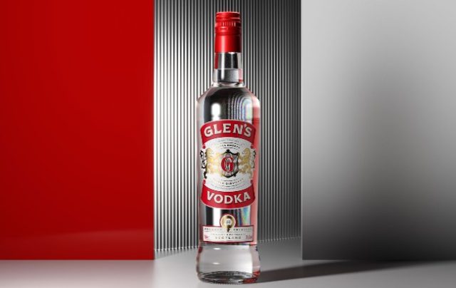
Glen’s Vodka has refreshed the packaging design across its full product range to improve shelf ‘stand out’ and quality cues, while remaining quintessentially ‘Glen’s’.
John Grieveson, chief marketing officer of Glen’s Vodka owner Loch Lomond Group, said: “Over the last two years we have increased our investment in marketing, forging rewarding partnerships with the Scottish Professional Football League (SPFL) and the British rugby Super League, as well as executing special on-pack promotions, executing UK-wide OOH (out-of-home) media campaigns, building our social media presence and producing an ongoing line of new product development. This has resulted in record levels of success for the brand, keeping us significantly above the category average.
“We expect to see a continued increase in demand for brands that can offer quality at affordable prices and so we felt it was the perfect opportunity for us to refresh our branding to help ensure our packaging matches our product offering.
“A bolder brand with better standout gives us the opportunity to create greater product recognition and generate more colourful communication off pack with a wider consumer base, especially with new product development in the pipeline.”
The Loch Lomond Group turned to Glasgow-based creative agency Thirst to orchestrate Glen’s brand evolution, which prioritises a focus on its Scottish provenance.
Thirst’s primary challenge was to overcome the brand’s ‘drifting sense of identity’, which was believed to have become a ‘threat to perceptions of quality’ and the brand’s growth.
“For over 20 years Glen’s has been part of the fabric of Scottish culture, synonymous with so much of what the nation is famous for – its sense of wit and fun,” Thirst’s creative director Matt Burns explained.
“Yet with ongoing fragmentation and a drifting sense of identity affecting quality perception and impeding growth, it was time to reassess the brand direction.
“We wanted to move it away from emulating inauthentic provenance and instead take pride and confidence in its own roots, at the same time retaining its distinct demeanour and straightforward quality that appeal to smart, value-seeking consumers and bring a refreshing lift to the category.”
The agency’s strategy was to lean into Glen’s roots and reposition it as ‘a sip of real Scottish spirit’, in order to give the brand a renewed relevance with both new and existing consumers.
Thirst’s contemporary reimagining of Glen’s Vodka is based in the brand’s heritage.
The red, white, and gold palette remains on the label, as do lions on the brand mark, however they have been recrafted to amplify the vodka’s ‘reliable taste experience’.
It also now boasts a simplified monogram and the addition of a quality panel, which have been added to provide authenticity and origin to the product story.
Refreshed and modern typography sits against the core colour palette, which underpins provenance, process, and experience as the basis for Glen’s off-pack brand and product messaging.
“With a fresh new story to tell and visual equities to convey it, this fresher, more modern Glen’s stakes its claim to everyday quality, and paves the way for the brand’s braver growth ambitions,” Burns added.
The reimagined Glen’s Vodka is available now.
In 2019, Glen’s Vodka launched a low-ABV range of flavoured spirits.
Related news
Glendronach debuts GTR-exclusive line