Jameson revamps Original bottle
Pernod Ricard-owned Jameson Irish Whiskey has refreshed the design of its original green bottle, kicking off a packaging overhaul for the brand.
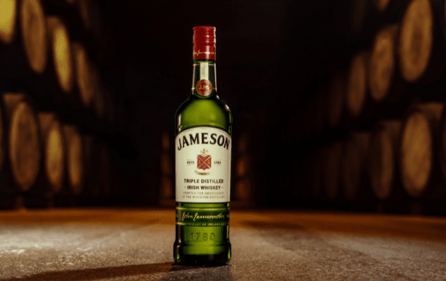
Features of the new-look bottle of Jameson’s Original triple-distilled expression include a brighter colour palette for greater shelf impact, a refined logo and ‘elevated tactile elements’. Jameson said these elements reinforce the brand’s premium quality while staying true to its approachability.
The brand has also increased foil cover on the bottle and introduced textured varnishes, embossing and micro-embossing.
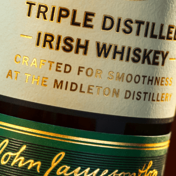
Jameson’s home of Midleton, County Cork, is highlighted on the label for the first time. ‘Crafted for Smoothness at the Midleton Distillery’ now features on the front label, telling the brand’s story and nodding to where Jameson is made.
The redesigned bottle maintains Jameson’s classic look. The brand emphasised: ‘It’s a new look, but there is no mistaking it; it must be a Jameson.’
While Jameson’s bottle has undergone tweaks over the years, these have been subtle and its packaging style has remained consistent. The brand said the redesign ‘mirrors the journey from the Jameson Distillery Bow Street, which began over 200 years ago, to Midleton in 1975’.
Carol Quinn, archivist at Irish Distillers, which owns Jameson, said: “This redesign is about more than aesthetics; it deepens the connection between what consumers see on the shelf and the story behind the whiskey. The journey from Bow Street in Dublin to Midleton in Cork in 1975 was a turning point in Irish whiskey history.
“At the time, Midleton Distillery was one of the most technologically advanced distilleries in Europe, and the move played a key role in a new chapter for the Irish whiskey industry. This visual evolution mirrors that migration from Bow Street to Midleton and celebrates the brand’s status as a symbol of Irish whiskey excellence today.”
The new Original bottle will roll out across all formats, including 700ml, 750ml, one litre and 50ml.
It is the first in a series of packaging updates across Jameson’s portfolio, which will roll out later in the year, including the brand’s Crested and Distiller’s Batch bottles in autumn.
Jameson Single Pot Still will get a new name along with its new design.
Anna Kelly, global head of marketing at Irish Distillers, added: “The Jameson Original pack restage provided us with an opportunity to link the brand more closely to its proud home at Midleton Distillery.
“The new messaging on the bottle celebrates Midleton as the centre of excellence for Irish whiskey craft and innovation. This refresh reinforces the premium quality of the liquid without losing the approachability and iconic elements that make the brand so recognisable around the world.”
Last year, the brand reimagined its Black Barrel bottle. The redesign was backed by a campaign fronted by actor Aaron Taylor-Johnson.
Redesigns can help spirits brands stay front of mind with restless consumers, a topic SB spoke about with Pond Design, the design agency behind the refreshed Jameson Original look in 2019.
Related news
Bardstown Bourbon Co updates packaging