How can design aid brand growth?
In a fast-moving drinks market, strategic limited editions and brand redesigns can keep a brand front of mind with restless consumers, but getting it right isn’t as simple as it sounds.
Have you ever wondered what it takes to pull off an authentic and effective brand collaboration that resonates with consumers? How about what goes into implementing a brand glow-up? We sat down with Fredrik Svalstedt, partner at leading design agency Pond Design, to discuss how alcohol brands can use limited edition releases and brand refreshes to excite and inspire, without compromising their identity.
“I think consumers are demanding a lot more from brands today than they have previously,” Svalstedt tells me from his office in Stockholm, Sweden. “They expect them to come up with new innovations, really attractive designs, and also to listen to their needs. We [at Pond Design] need to work hard to come up with ideas and propositions that really excel and also meet the demands of consumers,” he says.
Understanding the needs and expectations of consumers is something Svalstedt says is at the agency’s core. When approaching a project, whether it be a brand collaboration, brand refresh, or bottle redesign, the company always starts with the understanding phase. “We listen to the consumers, what they are looking for, what the consumer need is, what occasions could be relevant. We will often look at the overarching market trends. We use quantitative and qualitative research to find the drivers behind what gets clients or customers going. Then, when we understand and match the internal level and the external perspectives, we move forward and create our proposition.”
Svalstedt says it is important to understand the insights and consumer drivers before they start designing and creating. The design industry has changed massively in the way client discussions typically go today compared with 10 years ago. “You need to be pragmatic today. A couple of years ago, you would have one model, and say: ‘This is our process, and this is how we do it, you have to invest this kind of money.’ But today, clients don’t have that kind of money. Perhaps they don’t have the time, or they have already done a lot of things. We need to have an open dialogue with our clients to understand what they have, what they can invest, and make the best out of that.”
The process, stretching from receiving an initial brief to delivering the project to the client, takes on average 12 to 15 weeks, “depending on the scope, of course,” Svalstedt explains. Then, there are a number of ways the agency and its clients can determine a project’s success.
“As an agency, of course, we want to make things that help the clients grow, and they have the best knowledge around that.” As such, he says they often ask the client for sales figures or brand engagement numbers to ensure that the campaign or design has had the desired effect. “We always have a dialogue with our clients. We ask: ‘Is the new design in line with your expectations and your goals? Do we need to tweak anything? Or are you happy to move forward?’ so we ensure that we have done the best we can do to make it work.”
For Pond Design, success has been regular, especially with some of its long-standing clients, such as Jameson Irish Whiskey, with which it has had a partnership for almost 12 years.
“We have helped them to create a lot of projects over the years. I’m really proud of [how we have helped] Jameson reach a position within the whiskey world that it hadn’t before it started the journey,” he says, noting that the Irish Distillers-owned brand is now the top whiskey within the category, with sales having skyrocketed over the years. “It has had really a fantastic journey. And that’s not only our work, of course, it’s a combination of different things – but we have been a part of that journey, and that is something we, and I personally, are really proud of.”
Refreshing a brand
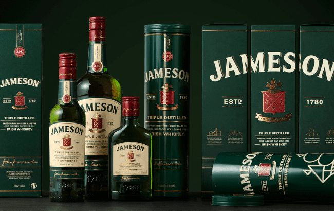
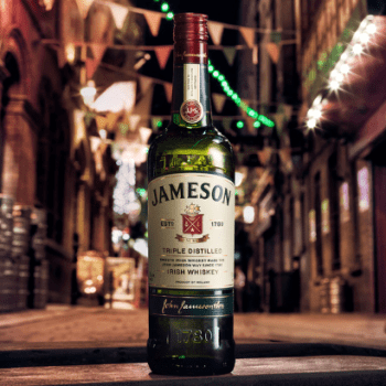
Part of the journey Svalstedt is referencing is the agency’s redesign of Jameson Original.
The commission, put to Pond Design in 2019, was to help evolve and modernise Jameson Original, with a design that would reflect the brand’s idea, vision, personality and values. Furthermore, it needed to deliver strong on-shelf stand-out, resonate well with both bartenders and consumers, and establish a strong design base to anchor the rest of the Jameson family’s product portfolio.
“When we did the work, I think 95% of Jameson’s total volume sales was Original – so it was a really significant signature piece for the brand, and a really huge project with a lot of people involved from both sides.”
The agency went on to lead conversations in major markets with consumers and bartenders, which would reveal that Jameson Original was appreciated for its unpretentious attitude, personality, approachability and authenticity. In terms of design, analysis showed that some elements were working well, such as the brand’s iconic green bottle and the ergonomically bottle neck. However, the design was also perceived as somewhat outdated and in need of modernisation. In addition, the agency found the label details and overall design expression needed to be optimised to enhance the brand’s impact and to keep it relevant for the future.
To deliver on this, Svalstedt and his team chose to review every aspect of the bottle – structural, as well as copy and graphics. They looked to create a unique bottle shape with a tapered body, exclusively for Jameson. A distinctive embossed label ‘eyebrow’ and heel at the base gave the bottle a more tactile feel and made it memorable to hold, while the green glass and easy-to-pour neck remained.
For the label, the colour scheme was refreshed, the Jameson family crest was redesigned, and all was printed on textured paper. The most recognisable features of the brand’s identity remained, enabling the team to create a more timeless and cohesive look.
The final touch was the decision to streamline the messaging on the bottle to emphasise the triple-distilled production method of Jameson Irish Whiskey.
All of these changes were slight but meaningful. While keeping the core brand assets in place but enhancing the details, such as the tactility and hand feel, they were able to preserve what consumers love most about the original design, while making the bottle feel less ‘dusty’. Ultimately, he says, a brand refresh is about preserving the emotional connection consumers have with the product, while enabling the brand to evolve.
Brand collaborations
However, for some brands, a refresh or a new look isn’t always a road they wish to travel down. Instead, to remain front of mind for consumers, or to bring some excitement and energy to the brand, some look to collaborations with other brands. Svalstedt confirms this is a great way to drive growth, though he notes that collaborations should be approached with consideration to ensure they feel organic, purposeful and mutually beneficial.
He advises each brand to have a defined goal that both parties understand, whether driven by passion or business objectives. Furthermore, there has to be a genuine partnership within the collaboration – mutual respect is key, and it is important that neither brand feels “bought into” the collaboration.
To ensure strong alignment, each brand should deeply analyse each other’s stories and values in order to identify common ground or complementary attributes, and then focus on something that feels natural and authentic.
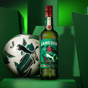
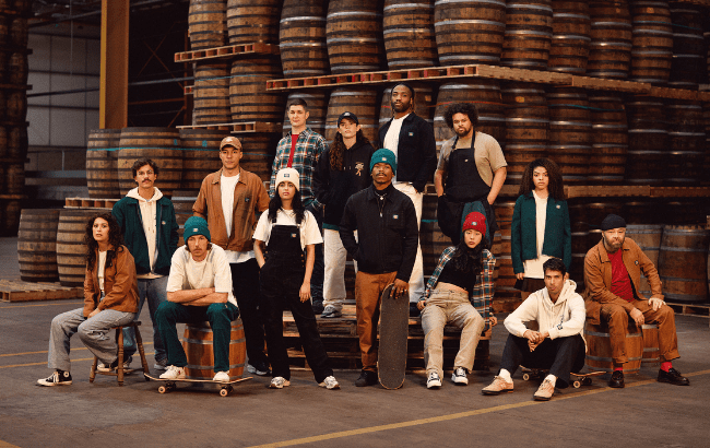
Pond Design has worked on several success stories in this field, once again with Jameson. “We did the collaboration with Jameson and Dickies, and a really interesting collaboration with Jameson and Anderson .paak, and also Jameson and Puma. That’s three projects that I’m really proud of, and I think really stretched the brand in trying to reach new consumers and new target groups.”
Jameson and Dickies released a workwear-inspired collection of apparel, accessories and a limited edition Jameson bottle as part of their Crafted Together campaign. Svalstedt believes this worked well for a number of reasons: “They share the same brand DNA. It all comes down to workers. They have a workers’ attitude – a blue-collar worker’s attitude – so they share the same values.
“When we worked on this limited edition bottle, and we read the brand story for Jameson and the brand story from Dickies, they were almost the same. It felt like a perfect match, even though it’s two different categories, two different brands. It felt almost like they’d lived side by side all their lives with the same attitude towards life, but they hadn’t met. It felt so natural.”
He also believes the project allowed for the communities associated with each of the brands to suddenly have a chance to connect and integrate, which may not have happened otherwise.
Bringing together two separate categories, such as apparel and spirits, is a great way to open brands up to new audiences, he adds. It is also an opportunity to “inject new energy” into the brand while building each brand up.
The multi-piece capsule for the collaboration included signature pieces such as the ‘iconic’ Dickies Eisenhower jacket and a limited edition Jameson bottle, as well as overalls, beanies, and caps. Svalstedt says wearable merchandise is a great tool for brands to enable consumers to build their own personal brand: “Clothes tell the story about you and who you are and who you want to connect with. I think in the past couple of years, what you drink is also important to tell something about your personality. You drink something with spirits, or you drink something with no or low alcohol, you drink just coffee – it tells me something about who you are. I think that’s why it’s interesting today to see these two different categories collaborate even more than a couple of years ago.”
Collectors’ mentality
It makes sense that consumers would respond positively to apparel releases, given the storytelling and personality aspect, but why, we ask, would a consumer care for a limited edition bottle design, when the liquid remains unchanged?
Svalstedt cites the collector’s mentality as a key driver for this style of activation. “I think consumers are wanting new things, and that need for new things is what’s driving collaborations and limited editions. I read an interesting report from Accenture the other day where they call it an ‘impatient economy’ – we are really impatient and we want more things at once.”
With that, he says this desire for instant gratification opens brands up to playing around with their designs, allowing consumers to get new experiences frequently, without the need for new liquid or product development. “Give me something new, and I will try it,” he says, noting that even though it’s just a new label, it’s something that helps brands connect to new audiences. “I think it’s a mindset of today, that you want more and you want it now. That demand from consumers really pushes brands to come up with new things. But, of course, collector’s mentality is one strong part. Especially men, they collect everything.”
By committing to a collection of things, such as limited edition bottle designs, for example, consumers demonstrate a commitment to a brand. Furthermore, it provides them with their own story to tell, especially when an element of exclusivity or rarity is introduced.
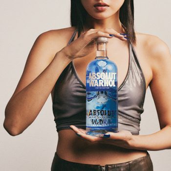
One brand that excels at producing limited edition bottles is Absolut, he says, sharing that the vodka brand is well-versed in tapping into relevant cultural moments that align with consumers and meet their needs.
“It’s a lot about matching the brand with the right moment. There are a lot of events during the year, and a lot of brands competing on the bigger events. You need to have insights about your consumer, what they are striving for and what drives them, and then try to find that moment, that event that connects to their life and their needs. When you do that, you really have the potential to create something impactful.”
He references Absolut’s rainbow design bottle, which was released to align with the LGBTQ+ movement. “That was a fantastic initiative and limited edition that really supports that community. They have done it for many years, and they have done it with two different limited edition bottles. We had the opportunity to create the first one. It was a fantastic project, and I’m really proud of that.”
He adds: “Absolut is a fantastic brand with a really strong heritage and a strong brand DNA. They have done a lot of great campaigns during the years, but when it comes to bottle design and limited editions, they have perhaps one of the most iconic brands.”
Related news
Brother's Bond unifies range with packaging redesign