Complaint against Dead Man’s Fingers quashed
A complaint against Halewood Artisanal Spirits’ brand Dead Man’s Fingers regarding its association with dangerous behaviour has not been upheld.
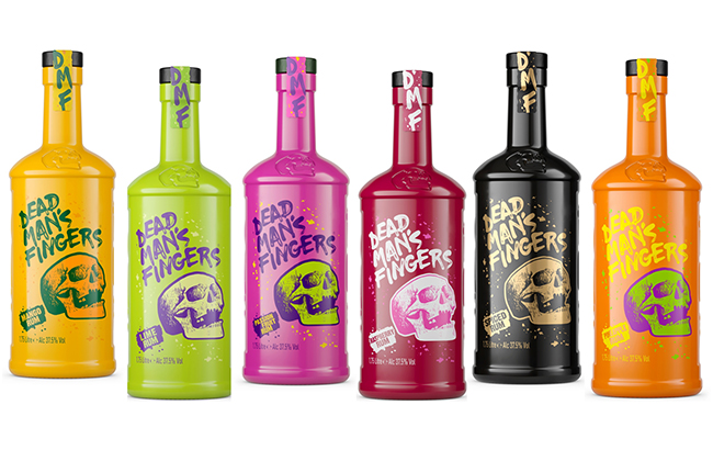
The complaint, made by a member of the public to the alcohol industry’s Independent Complaints Panel (ICP), stated that Dead Man’s Fingers Tequila Reposado and Dead Man’s Fingers Super Spiced Rum were both associated with dangerous behaviour.
The complainant said they were “shocked” to see the word danger “highlighted” on the bottle, and claimed that “for an alcohol brand” this “can’t be ok”.
Concern was also expressed by the complainant about the skull symbol on the products, said to symbolise “illicit danger”.
While Code 3.2(b) states that ‘a drink, its packaging and any promotional material or activity should not in any direct or indirect way suggest any association with bravado, or with violent, aggressive, dangerous, anti-social or illegal behaviour’, the complaint was not upheld by the IPC.
The chair of the ICP, Nicola Williams, said: “We are supportive of producers being creative and using this in all aspects of a product and design, including naming. This case shows that producers can be edgy to appeal to their customers as there was no association with dangerous behaviour.”
Halewood stated that it “respectfully disagreed” Dead Man’s Fingers products are in breach of Code 3.2(b), and while the range is “generally edgy and bold”, the brand’s name is a “play on words relating to the inedible part of a crab”.
While the skull is a “characterisation of death”, it is intended to “depict the consumption of the finger-like gills inside a crab, also known as ‘dead man’s fingers’”, Halewood continued.
Design “integral” to success of brand
A spokesperson for Halewood said: “We agree with the panel’s finding and in our opinion this was never a breach of the Code. Dead Man’s Fingers’ edgy design is integral to the success of the brand, and often these good intentioned processes are open to abuse by less successful competitors under a disguise of a consumer.”
The producer also stated that the bottle design was “playful”, “in no way violent or dangerous”, and that the marketing and branding was “in keeping” with the brand, with its name a “fun twist” in relation to historical mythology.
In reviewing the skull imagery on the bottles, the panel considered that this was “akin to imagery from the Day of the Dead Festival”, and was used to create an “edgy brand feel” to appeal to its target market of young adults.
No action will be taken.
Earlier this month, the UK’s Advertising Standards Authority (ASA) investigated 21 complaints against hard seltzer producer Served in response to two sponsored Facebook ads, two posts on Served Drinks’ Instagram page, and a marketing email.
The Facebook posts were investigated over their health claims, and found by the ASA to have breached the Code for suggesting they were beneficial for health-related wellbeing.
Related news
Weavers sacked from Uncle Nearest amid federal investigation
Uncle Nearest receiver claims lender 'ignored red flags'
Brand ambassador sues Campari America alleging wrongful termination