Martin Miller’s reveals new label
Zamora Company has revealed a label redesign for Martin Miller’s Gin – the first in the brand’s 21-year history.
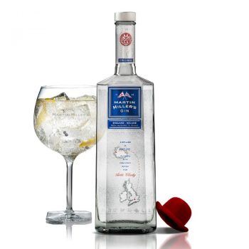
The updated label celebrates the brand’s dual heritage between England and Iceland.
The redesigned logo and England-Iceland map are screen-printed onto the back of the bottle, meaning they are visible through the glass and gin.
A brand seal has also been installed on the neck label to give greater shelf standout.
Robert Eastham, Martin Miller’s Gin global sales and marketing director, said: “A new stylised look with more modern cues and a solid brand block for the Martin Miller’s Original Gin reference whilst keeping the famous bottle shape first developed in 2006.
“In such a competitive market as we have with the gin category, it is vital that Martin Miller’s Gin keeps its head above the crowd and continues to be the beacon of consistent excellence and quality, a reflection of the awards and recognition it receives from peers, trade partners and consumers.
“We are delighted with the attention to detail and quality execution that has been achieved after working in partnership with our design agency, Cartils, plus all our suppliers – and particularly despite the challenges posted by the Covid crisis.”
Last September, the gin brand hired two artists to create an experiential installation in London as part of a series of global initiatives.
Related news
Diageo shuts Aviation Gin visitor centre
Eight Lands Organic Gin and Vodka show Speyside in new light