1800 Tequila gets a design refresh
Proximo Spirits-owned 1800 Tequila has undergone a packaging redesign as part of a wider brand relaunch.
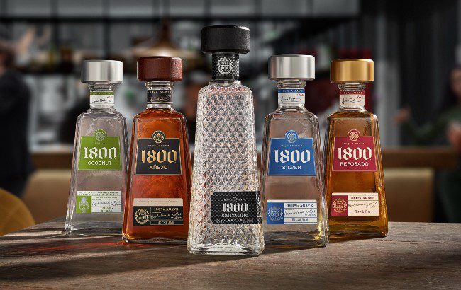
The new packaging, which features new iconography on the bottle neck, has been designed to showcase ‘the art of Tequila’ within the production process, as well as the brand’s rich heritage and additional nutritional facts.
It has also undergone a ‘language shift’ by calling out the category variant and Spanish language accents to drive authenticity.
“There is still a significant piece of consumer education to be completed within the Tequila category, and one of the ways we are addressing this is with our packaging innovation,” said Proximo Spirits representative Gordon Dron.
“Our new designs highlight 1800’s unique production process, using hand-picked harvests from family-owned ranches in the highlands of Jalisco, Mexico, and 10 generations of expertise – something which really sets us apart from our competitors.”
The brand has evolved the packaging of its Silver, Coconut, Añejo & Reposado expressions, but has not changed the ‘iconic’ Cristalino or Milenio design, due to its existing bespoke packaging architecture, which was created to reflect their luxury positioning within the range.
The brand hopes that the rebrand will encourage trade education and consumer awareness to drive trial of the product in the UK.
Last month 1800 Tequila added a strawberry edition to its line-up of flavoured ready-to-pour Margaritas.
Related news